Latitude, contrast and dynamic range
Three related but distinct ideas, endlessly confused:
In short
Dynamic range – the span of scene brightness, from deepest recorded shadow to brightest held highlight, that the film can capture at all. Measured in stops.
Exposure latitude – how far your exposure can be wrong and still yield a usable result. It is what’s left of the dynamic range after the subject’s own contrast is subtracted.
Contrast / gamma – how steeply the film converts a change in light into a change in density. Set by the emulsion and by development.
Rough ranking of usable dynamic range: colour/B&W negative (12–14+ stops) ≫ slide film (5–6 stops) ≈ or slightly under digital.
Reading it off the characteristic curve
Everything here is visible in the characteristic curve – the plot of density (how dark the developed film is) against log exposure (how much light it got, in stops).
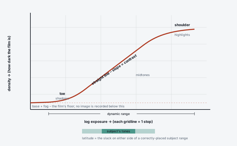
The curve has three parts: the toe (shadows, gently rising), the straight line (midtones, constant slope = contrast), and the shoulder (highlights, flattening out). Negative film has a long straight line and a soft shoulder; slide film is steep and shoulders off abruptly.
Toe – very low exposures. Slope is shallow, so shadow separation is weak. Below the toe there is only base+fog: no image.
Straight line – the working range. Its slope is the film’s contrast (gamma / gradient). Equal stops of light produce equal steps of density.
Shoulder – high exposures. Slope falls again; highlights compress together. Negative film rolls off here gently (highlights stay separated a long way); slide film has almost no shoulder (highlights hit maximum density – clear film on the projected image – and stop).
Dynamic range
The horizontal distance between the darkest tone that clears the toe and the brightest tone still on a usable part of the shoulder, expressed in stops of exposure.
Medium |
Usable range |
Character |
|---|---|---|
B&W negative (e.g. HP5+, TMax 400) |
~13–16 stops with careful development |
Enormous highlight headroom; the classic “you can’t overexpose B&W neg” latitude. |
Colour negative (Portra, Gold) |
~12–14 stops |
Long soft highlight roll-off; noisy in deep underexposure. |
Digital (modern full-frame) |
~12–15 stops at base ISO |
Clean shadows (lift in post), hard highlight clip. |
Colour reversal / slide |
~5–6 stops |
Beautiful within range, brutal outside it. Clipped highlights = clear film. |
Fun fact
Colour negative film’s ability to hold a 14-stop scene is why disposable cameras work. They have one shutter speed (~1/100), one aperture (~f/10) and no focus – the film absorbs the exposure errors. Put slide film in a disposable and most frames would be unusable.
Exposure latitude
Latitude is dynamic range minus subject brightness range. A scene that spans 5 stops shot on a 14-stop film leaves ~9 stops of slack – split either side of “correct”, so you could be several stops off and still print it. The same film shooting a 12-stop contrasty scene has almost no latitude left; now exposure must be precise.
Key idea
Latitude is not a fixed number for a film – it depends on the scene. “Portra 400 has huge latitude” is true on an overcast day and much less true at high noon in the desert. And latitude is asymmetric: negative film gives you many stops of overexposure and few of underexposure; slide film gives you a little of each; the practical advice (“overexpose negative, protect slide highlights”) falls straight out of the curve shapes.
Typical rules of thumb for a normal-contrast scene:
Film |
Overexposure tolerated |
Underexposure tolerated |
|---|---|---|
Colour negative |
+3 to +5 stops (often improves) |
−1 stop, −2 at a push |
B&W negative |
+3 to +6 stops |
−1 to −2 stops |
Colour slide |
+½ stop |
−1 stop (deliberate, for saturation) |
Contrast and gamma
The slope of the straight-line section. Steeper = more contrast = a given brightness difference in the scene becomes a bigger density (and eventually tonal) difference.
Contrast comes from two places:
The emulsion. Ektar 100 and Velvia 50 are inherently high-contrast, high- saturation designs; Portra and Kodak Gold are lower-contrast. B&W films sit across a range (Delta 100 punchy, HP5+ moderate, ортho films very contrasty).
Development. For B&W especially, longer/warmer/more-agitated development raises contrast; this is a deliberate control. The measured contrast at a stated development is quoted as gamma (γ) or average gradient (Ḡ, “G-bar”) or, for a specific printing standard, Contrast Index (CI). A “normal” pictorial CI is roughly 0.55–0.62.
Jargon buster
gamma (γ) – slope of the straight-line portion only. contrast index / average gradient – slope of a line drawn between two defined points on the actual curve (toe included), which is what matters for real pictures. “normal”, “N+1”, “N−1” – Zone-System shorthand for developing to standard contrast, or one zone more/less to fit a flat or contrasty scene onto the paper.
Practical consequences
Contrasty scene (bright sun, deep shade in frame): use negative film, rate it slow (more shadow exposure), and – for B&W – cut development (“N−1”) to keep highlights printable. Slide film will simply not fit the scene.
Flat scene (fog, overcast, snow): you have latitude to spare; you may want more contrast – shoot slide, or a punchy neg, or push B&W development (“N+1”).
Unpredictable light (travel, street): ISO 400 colour negative rated at ~250–320. The latitude is the whole point.
You want the scene rendered exactly as your meter says, with rich colour: slide film, incident meter, bracket ±½ stop.
Where to go next
The characteristic curve – the curve in full detail, with real film examples.
Colour negative film vs Colour reversal (slide) film – the two families compared.
Pushing and pulling film – moving contrast around with development.