Spectral sensitivity: what colours the film can see
A film’s spectral sensitivity is the graph of how strongly it responds to each wavelength of light. For black-and-white it decides how colours become greys; for colour it defines the three recording channels.
In short
Bare silver halide sees only blue and UV. Sensitising dyes extend it to green (“orthochromatic”), the whole visible range (“panchromatic”), or beyond (“infrared”).
Panchromatic B&W does not map colours to greys the way your eye expects – it is over-sensitive to blue and a bit weak in green. Filters correct or exploit this.
Orthochromatic film (red-blind) can be developed under a red safelight and gives a distinctive heavy-skies, dark-lips look; it is enjoying a small revival.
Colour film stacks a blue-, a green- and a red-sensitive emulsion; a yellow filter layer under the top layer stops blue leaking into the lower two.
The families
Type |
Responds to |
Practical notes |
|---|---|---|
Blue-sensitive (“ordinary”, unsensitised) |
~360–500 nm |
The earliest emulsions. Skies blow to white, reds and greens go near-black. Still used for line/litho films, some duplicating films, and darkroom paper. |
Orthochromatic |
blue + green, to ~590 nm; red-blind |
Safelight-friendly (deep red). Reds→dark, greens→lighter, skin→ruddy and contrasty. Films: Ilford Ortho Plus 80, Rollei Ortho 25 Plus, Fomapan 100-in-ortho behaviour under some developers. A “vintage portrait” look. |
Panchromatic |
full visible ~360–680 nm |
Standard since the late 1920s. Renders colours as tones close to (not identical to) luminance. Must be handled in total darkness. |
Extended red / IR |
visible + near-IR to ~740 nm (SFX) or ~820–900 nm (Rollei IR, ex-Kodak HIE) |
With a deep-red or opaque-IR filter: white foliage (“Wood effect”), black skies, penetrating haze. Needs focus compensation (IR focus mark) on older lenses. |
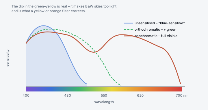
The same figure from Silver halide: the light-sensitive heart of film: each sensitising-dye class pushes the response further across the spectrum.
How panchromatic film renders colour as grey
Two surprises for people used to digital:
Blue is rendered too light. Skies come out pale, haze and atmospheric blue wash out distant hills, and blue eyes/clothing glow. Panchromatic emulsions retain strong native blue sensitivity on top of the dye-added response.
Green is rendered slightly dark, because the classic panchromatic dip sits in the green–yellow (see the curve). Foliage can look heavier than expected.
The fix is a coloured filter over the lens, which lightens its own colour (passes it) and darkens the complementary colour (blocks it):
Filter |
Factor (stops) |
Sky |
Common use |
|---|---|---|---|
Yellow (Y2 / #8) |
⅔–1 |
Slightly darker, natural |
“Correction” filter – default for outdoor B&W. Restores eye-like tonality. |
Orange (#21) |
1½–2 |
Distinctly darker, clouds pop |
Landscape drama, cuts haze, smooths skin blemishes. |
Red (#25) |
2½–3 |
Near-black, high contrast |
Dramatic skies, white clouds, dark foliage. The Ansel Adams sky. |
Green (#11 / #58) |
1–2½ |
Lighter |
Lightens foliage, separates greens; flatters some skin, darkens lips. |
Blue (#47) |
2–3 |
Lighter, more haze |
Rare; increases haze, “period” look. |
Jargon buster
Filter factor – how much extra exposure the filter needs, as a multiplier (×2 = 1 stop) or in stops. A camera’s TTL meter reads through the filter and mostly compensates automatically, except that meters are not equally sensitive to all wavelengths, so a deep red filter can still need ~½–1 stop of extra hand-applied compensation. Handheld-meter users apply the full published factor.
Colour film: three channels and a yellow trap
A colour film is a spectral-separation device:
Top: blue-sensitive layer. Every emulsion is inherently blue-sensitive, so this goes first and takes the hit.
Yellow filter layer (Carey Lea silver, or a bleachable yellow dye). Absorbs blue so it cannot reach the layers below. Removed/bleached during processing.
Middle: green-sensitive layer (orthochromatically sensitised, blue response now screened off).
Bottom: red-sensitive layer (panchromatically… i.e. red-dye sensitised).
Each layer’s spectral sensitivity is tuned – including deliberate overlaps and gaps – to control colour reproduction. Fuji and Kodak historically diverged here: Fuji’s green/red sensitivities and its “4th cyan layer” (in Reala / Pro films) were designed for a particular rendering of foliage and skin, part of why “Fuji greens” and “Kodak warmth” are real signatures and not just marketing (see How colour film works).
Fun fact
Digital sensors have the opposite problem. Silicon is strongly sensitive to near-infrared, so every colour digital camera needs a hot-mirror / IR-cut filter glued in front of the sensor. Film’s silver halide is naturally IR-blind unless dyed for it – so shooting infrared is easier on unmodified film than on an unmodified digital camera.
Where to go next
Filters for film – the full filter guide, colour and B&W.
How colour film works – the three-layer stack and dye chemistry.
Specialty and oddball films – ortho, IR and redscale in practice.