How colour film works
Colour film records a full-colour image on a strip that contains no coloured material until it is developed. The trick is three stacked black-and-white emulsions, each tied to a dye-forming chemical that only activates where that layer was developed.
In short
Colour film separates the image into red, green and blue records using three spectrally sensitised emulsion layers (see Spectral sensitivity: what colours the film can see).
During development, oxidised developer reacts with a dye coupler in each layer to build cyan, magenta and yellow dye – the subtractive primaries.
The silver is then bleached and fixed away; only the three dye images remain.
Colour negative adds an orange mask – built-in coloured couplers that correct the dyes’ imperfections. That’s why negatives look orange.
Differences between Portra, Gold, Ektar, Superia, Velvia come from coupler choice, curve shaping, inter-layer (DIR) chemistry and the spectral sensitisations – real engineering, not filters.
Additive vs subtractive colour
Your eye and a screen work additively: red + green + blue light add up to white. Early colour photography (Autochrome, 1907) used a mosaic of red/green/blue starch grains over a B&W emulsion – additive, dim, and a dead end.
Film and print work subtractively: start with white light and remove parts of it with dyes.
Cyan dye subtracts red.
Magenta dye subtracts green.
Yellow dye subtracts blue.
Cyan + magenta + yellow together ≈ black.
So the red-sensitive layer must end up carrying cyan dye (the one that controls red), the green-sensitive layer carries magenta, and the blue-sensitive layer carries yellow. Each layer is a valve for its own colour of light.
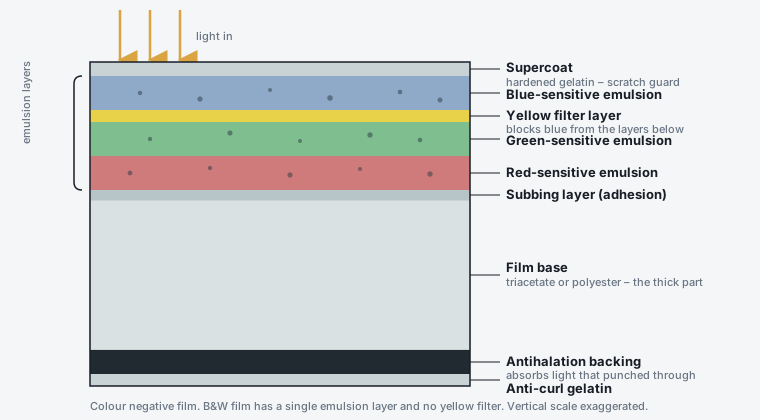
The stack. Blue is caught first (all emulsions are blue-sensitive), then a yellow filter layer screens blue from the green- and red-sensitive layers below.
Chromogenic development, step by step
“Chromogenic” = “colour-generating”. This is the C-41 (negative) and E-6 (reversal) mechanism (see C-41: colour negative processing).
Exposure creates a latent silver image in each of the three layers, according to how much red / green / blue light reached it.
Colour developer – a CD-type developing agent (a substituted p-phenylenediamine, e.g. CD-3, CD-4). It reduces exposed silver-halide crystals to silver, and in doing so it is itself oxidised.
The oxidised developer is highly reactive and immediately couples with a dye coupler molecule dissolved in that same layer, forming an azomethine dye – cyan, magenta or yellow depending on the coupler designed into that layer – right where the silver formed.
Bleach converts the metallic silver back to silver halide.
Fixer dissolves all the silver halide (both the bleached image silver and any undeveloped grains) and washes it out.
What remains: three superimposed dye images and nothing else. Stabiliser/final rinse protects the dyes.
The amount of dye in each spot is proportional to the exposure that spot’s layer received – a continuous-tone colour image.
Fun fact
The couplers were the hard part. Kodachrome (1935) had no couplers in the film at all: the dyes were built in during a lab-only process that introduced them from three separate colour developers, one layer at a time (its final form, K-14, ran to more than a dozen steps). That is why only a handful of labs on Earth could process it, and why it ended in 2009. Agfacolor Neu (late 1936) solved it by putting the couplers in the film, using long “ballast” carbon chains so the dye molecules stayed put in their layer. That is the ancestor of every C-41 and E-6 film since; Kodak’s own coupler-incorporated negative film, Kodacolor, followed in 1942.
The orange mask (colour negative only)
Hold a developed colour negative to the light and it is orange. This is deliberate.
The cyan and magenta image dyes are not spectrally perfect – the cyan dye also absorbs some blue and green, and the magenta dye also absorbs some blue. Left uncorrected this muddies every colour in the print.
The fix: make some of the couplers already coloured before development.
The cyan-forming coupler is itself orange-red. Where cyan dye forms, an equal amount of this orange coupler is used up; where no cyan forms, the orange stays. The leftover orange is a positive mask of exactly the cyan dye’s unwanted blue+green absorption – it cancels out.
The magenta-forming coupler is yellow, masking the magenta dye’s unwanted blue absorption the same way.
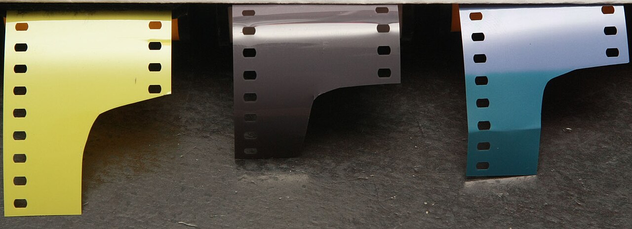
The orange you see in a colour negative is the unused masking couplers – a built-in correction for the cyan and magenta dyes’ unwanted absorptions. [Photo: Drcooling, CC BY-SA 3.0]
The uniform orange base you see is the unused masking couplers. It is why:
Colour negatives must be printed/scanned with the mask subtracted (RA-4 paper and scanner software are built for it).
Cross-processing slide film in C-41 gives no mask → wild, uncorrected colour.
Each film stock’s mask has a slightly different orange (Kodak vs Fuji vs Cinestill, the latter minus remjet), which trips up automatic scanner inversion.
Slide film has no mask – the dyes are viewed directly and any impurity is accepted as part of the look (Velvia’s colour is “wrong” in a way people love).
Where brand signatures actually come from
Two colour negative films at the same speed differ because of:
Design element |
Effect on the look |
|---|---|
Coupler chemistry |
The exact hue and stability of each dye. Kodak’s magenta/yellow lean warm; Fuji’s cyan/green rendering is a signature (the “4th layer” cyan-sensitive addition in Reala / Pro 400H made greens and skin coexist better). |
Curve shape per layer (see The characteristic curve) |
Contrast and where highlights roll off. Portra: low contrast, long shoulder, desaturated. Ektar: steep, saturated, short shoulder. Gold: warm, slightly S-shaped, punchy midtones. |
Inter-layer interimage effects / DIR couplers |
DIR (Development-Inhibitor-Releasing) couplers release a diffusing inhibitor as they form dye, suppressing development in adjacent layers. This boosts saturation, sharpens colour edges, and improves colour accuracy. How aggressively a film uses them is a major tuning knob. |
Spectral sensitisations |
Slightly different R/G/B band placement changes how, say, a particular blue-green or a skin tone is split between layers. |
Grain / dye-cloud structure |
Portra 400’s near-Portra-160 grain is T-grain + optimised couplers. |
Masking couplers |
Tuned per film; part of why scans of different stocks need different profiles. |
Myth vs reality
“You can make any film look like Portra with a preset.” Colour grading can move hue and contrast, but it cannot reproduce how a film splits a colour between layers, its DIR-driven edge colour, its highlight-shoulder colour shift, or its grain colour. A Gold-shot frame graded toward Portra still carries Gold’s DNA in the skin-tone-vs-foliage relationship and the way a blown window renders. The look is in the separation, not just the palette.
Colour reversal (slide) – same chemistry, flipped
E-6 uses the same couplers but an extra pair of steps inverts it:
First developer (a B&W developer) develops the exposed silver to a negative silver image – no dye yet.
Reversal / fogging step makes the remaining (previously unexposed) halide developable.
Colour developer now develops that halide, forming dye in a positive pattern.
Bleach + fix remove all silver.
Result: a positive colour transparency. Details in E-6: slide processing.
Chromogenic (“C-41”) black-and-white
Ilford XP2 Super and the discontinued Kodak BW400CN / Portra-era films are B&W pictures made by the colour process: the couplers form neutral (grey) dye instead of coloured dye, silver is bleached out, so the image is dye, not silver. Benefits: very fine, smooth grain that improves with overexposure, huge latitude (EI 50–800 on one roll), and processing at any 1-hour colour lab. Downsides: dyes less archival than silver, and it won’t work with a true B&W enlarger’s contrast controls.
Where to go next
Colour negative film and Colour reversal (slide) film – the film families in use.
C-41: colour negative processing – the negative process in detail.
Who actually makes film in 2026 – who formulates these emulsions now.